Building Gravity: A Design System out of this World
Greetings, everyone! It’s been an amazing year for the Rupeek Design team. We are thrilled to announce the launch of our exciting new product, Cards. This has inspired me to finally document the little journey that led us here. Let’s buckle up, shall we?
Design systems are all the rage these days. Why not? They are awesome! The approaches and advantages of building a design system have been documented very well by everyone and their dogs. Now, I know what you’re thinking, “Oh great, another article about design systems…yawn.” But trust me, I’m here to give you a fresh perspective on the matter and hopefully entertain you a bit along the way.

Let’s be real. Building Design Systems can be a daunting task. Before starting to build one, you must ask yourself if you really want to go down this rabbit hole. It can get infinitely complex and overwhelming. But, thankfully — there are plenty of resources available online. For us folks at Rupeek, it was needed to be built before things spiralled out of control.
So, how are Design Systems useful?
Increase in production efficiency, having a single source of truth for all the design and developmental decisions (no more files scattered across G-drive and Github) all while creating a consistent user experience, improving overall product usability, are some of the advantages of having a design system in place. Whether you’re starting from scratch or cleaning up a hot mess, a design system is like a secret weapon that’ll make your product better, faster, stronger, and more stylish than ever before.
And let’s not forget about communication. When your designers, developers, product, business, and other stakeholders are all speaking different design languages, it’s like they’re speaking different frequencies. But with a design system, everyone speaks the same cosmic language and there’s harmony and balance in the universe.
A well-crafted and mature design system can have a significant impact on the overall customer experience of a product. A design system ensures consistency in the user experience across all touch points, from marketing to customer service, which ultimately leads to a better overall customer experience. But don’t take my word for it — the data speaks for itself. Studies have shown that companies with a mature design system in place can achieve up to a 55% reduction in design and development time, a 75% increase in design consistency, and an amazing 91% increase in brand recognition. That’s out of the world, isn’t it?
Customer experience metric is tied to User experience. When a customer interacts with a product, they form an impression of the brand based on their experience. This experience can be positive or negative, and it can influence the customer’s decision to become a customer, continue using the product, or recommend it to others. To elaborate more — if you are thinking the customer experience for your user starts while they are using the product, you, my friend are wrong. Most of your product’s users probably experienced it way before they became a customer — maybe they saw your kiosk at the airport, or on a cable advertisement (yes, most of the fintech products in India advertise a lot) and will continue to experience it after they are no longer your customer as well — probably through customer service or a friend’s experience. So, it is extremely important to understand that the customer experience metric is largely tied to how the user experience is built and communicated through marketing/brand, the actual product and customer support. By having a design system in place, a company can ensure that the user experience is consistent and positive, which can lead to increased customer satisfaction and loyalty.
Influence UX at scale. In addition, a design system enables a company to make changes to the user experience quickly and easily, without disrupting the overall consistency. This can help a company to respond to customer feedback and improve the user experience over time, which translate to customer satisfaction and retention, on a postitive note.
Overall, a design system is a critical component of any product strategy, as it enables a company to create a consistent and positive user experience across all touch points, from marketing to customer service. By investing in a design system, companies can improve customer satisfaction and loyalty, which can ultimately lead to increased revenue and growth.
So, what constitutes a good Design System?
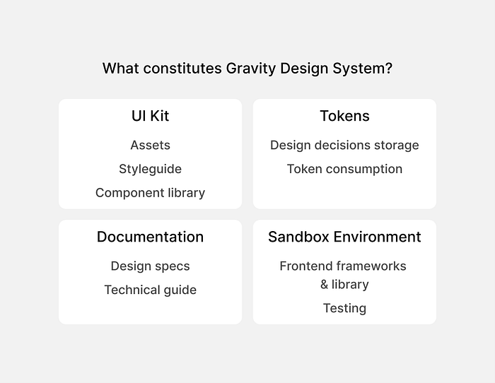
Welcome to the world of Gravity, where everything is bound together with the force of good design! But seriously, folks, building a dedicated team for our Design System is a no-brainer. As part of various evangelism workshops, we have used the following two slides in a larger presentation to generate buy-ins from Rupeek’s tech leadership to build a dedicated team for our Design System, Gravity (Why Gravity? Because it sounds cool? No, it’s not just that. Gravity as we understand, is a formidable force in our infinite universe which binds everything and that’s exactly what Gravity does). Gravity would help us deliver a product experience out of this world.

Gravity’s proposed technical architecture

This seems quite complex and perhaps sophisticated, isn’t it? Let me help you understand why we did what we did.
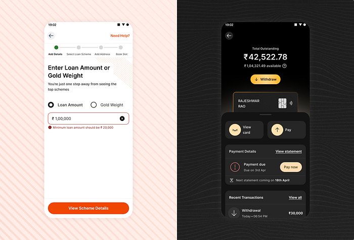
Okay, let me break this down for you — we had a serious case of orange overload going on. One of our customer-facing products was using six different shades of orange to represent interactive components in a single user journey. Six! It was like a rainbow exploded on our screens, but not in a good way. We knew we needed to get our act together and align our brand with our UI. Fortunately, there was a redesign on the cards and we moved at light speed to achieve Gravity’s vision of the future!

But, we knew we couldn’t do it alone. We knew we needed to communicate the magnitude of this project to every team in the company, so we put in the effort to evangelise the importance of a unified design system. We held workshops, we gave presentations, we even contemplated asking our UX writer to send everyone in the company full-blown newsletters (although budget constraints brought us down). But after all our efforts, we finally got some buy-in. We secured a designer’s full bandwidth and a developer’s 10% bandwidth in each of our two front-end teams. Hey, it’s a start, right?
Our vision for Gravity is to bring all of Rupeek’s products together through a modular design system that’s fully scalable and reusable.
Common misconceptions
Building a Design system isn’t a one-time effort. It requires constant attention and care to thrive. You can’t expect it to work forever without constantly updating it to the needs of your products and customers.
A design system is never just a system made to automate UI decisions or something that is built for visual consistency. (We failed to debunk this one among the larger org despite many consistent efforts). When properly built and used, it’s for everyone involved in building the user experience for the customer. That means marketing, product management, customer support, the whole shebang. Reducing it to just design and development is such a waste of good work.
How we built Gravity
As with any redesign exercise, the first part of the process is to take a good, hard look at what’s going on. We had to do some serious auditing to figure out where we were going wrong and what we needed to fix.
Before Gravity, our design team was a squad of 11 talented folks, all wrangling design problems in Adobe XD. We had a decent style guide in place but it wasn’t distributed properly, which led to a lot of disconnected styles being used and shipped out to users. It was like each of us had our own secret stash of amazing design elements but we weren’t sharing the goods. And don’t even get me started on the component library.
But, here’s the thing — the design team was working out of Adobe XD. Their files were all over the place. And to make matters worse, our developmental teams had their own style and component libraries too! We needed to get our act together, stat.
Our game plan to tackle our woes
Moving to Figma
First, we decided to ditch Adobe XD and hop on the Figma train. This is the first and probably the most important task if we were to build a Design system out of this world. We were like, “Where have you been all our design lives?” Figma had all the features we needed, like active collaboration, design system management, and a shared language with developers and product.
File Management
Next, we had to wrangle all of our XD files into to a centralised repository and convert them to Figma files. We found this amazing tool to migrate the files seamlessly. And to keep track of everything, we used Google Sheets like a boss.

Developing a strong style guide
Alright, to build a strong style guide, we realized we had to collaborate and align with the marketing team. Luckily, we were already in the midst of a redesign in anticipation of an advertising campaign, so it was like two birds with one stone. So, it was relatively easier to achieve this.
Component library
Now, let’s talk about our component library. Designers would spend hours debating on the merits of one search field versus another. But, the real issue was that we didn’t have a singular library that all stakeholders could access. It was like each designer had their own secret stash of amazing components, but no one wants to share them (just kidding, there was now way to share them). It was causing major inconsistency issues, which were in turn having a negative impact on brand trust and consistency. We knew we had to build a single source of truth for the component library.
Aligning the stakeholders
We quickly realised that design system isn’t really a design problem but a people problem. We knew that if we could align everyone to a common gravitational pull, anything was possible. And to make it happen, we had multiple ideation and brainstorming sessions with all our stakeholders to see how we could work together in harmony. And during one of these sessions, we came up with the name for our system — Gravity.
We knew we had conquered the hard part, now onto building Gravity
Brad Frost’s atomic design is probably one of the most important and well-known philosophies used in building Design Systems. He has revolutionised the way tech teams go about building products at scale through. Thanks to his consistent efforts, thousands of organisations could set a direction for their design teams and strategise everything that goes under the design system umbrella.
Although, the atomic philosophy really helped us understand and strategise at a foundational level, it quickly added to the confusion regarding what constituted an atom or a molecule or an organism. I quickly realized that it doesn’t just pertain to me, but to the larger team as well. After all, to our designers, a button, a phone number field, and a login form were all just components floating around in space. We didn’t need to get bogged down in the details of what constituted an atom, a molecule, or an organism — we just needed to make sure everything was working together in harmony.
We simplified things massively and focused on the essentials:
- Foundations — comprising of styles, assets, interaction, voice & tone
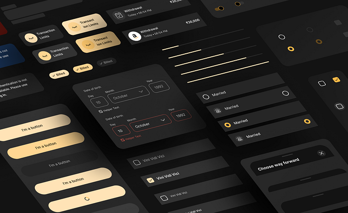
- Component Library — comprising of all components no matter how complex
- Tokens — building tokens for styles and components to document and communicate design decisions with the developmental teams
- Documentation — building detailed component spec sheets and design usage guidelines
- Deploy— working with the developers to build a framework to deploy the design system
- Testing — building a sandbox to view and test components
- Governance Process — maintenance of Gravity requires it’s own framework

Each part of our system took a lot of work and decision-making. We had countless debates and discussions with stakeholders before arriving at the best solutions. But, with every iteration, we got closer to creating a design system we were proud of.
Time for some learnings
- Alright, so first and foremost, you gotta evangelise the heck out of a Design System. It’s important to establish the correlation between customer experience metric and design system within the company.
- Team work makes the dream work! Working in a silo on the Design system often sets you back. You are building for your team, the customer and the company. Constant feedback loops will make generate buy-ins and increase adoption and engagement. Don’t forget to test your system with actual users too.
- Involving engineering teams early in the building process helps you blast through the challenges. Our token hand-off workflow was revised multiple times mostly because the design team was coming with a solution to the engineering team rather than collaborating with them.
- Treat your Design System as a living product and don’t be hung up on making a perfect system as perfect systems are a myth. Evolution is a must as for any product.
- Documentation shouldn’t be an afterthought and should go hand-in-hand while building libraries, components and frameworks. Otherwise, you are leaving everything up for interpretation!
- As with any initiative, measuring the success of a task closes the loop. During our time building Gravity, we had two metrics to measure it’s adoption — design adoption and dev coverage. You could also track efficiency and productivity gains.
Disclaimer
Just a heads up, this is my genuine attempt at sharing the journey of building Gravity over the past few years. However, as we all know, the universe is constantly expanding and evolving, and so are our approaches to design. Who knows, in the future, my approach might be as outdated as thinking the earth is flat (which it definitely isn’t, by the way).
However, this is the tale of how Gravity came to be, and how it’s currently fuelling successful products that are responsible for 1% of the organised Gold loan market in India (yes, you read that right, it’s about 6 trillion USD).
If you're up for a chat about building design systems, or anything related to product design, or even if you want to challenge me to a game of boxing, just shoot me a message.
